The principles of brand-led reception design
Your reception is the space in which impressions form, in which relationships begin, in which the gap between how a company presents itself online and how it actually feels to engage with is first revealed. Most companies spend significant budget on brand identity, on marketing, on the digital experience. Corporate reception design, done well, is one of the highest-leverage brand investments you can make. Here's how to think about it.
BRAND DESIGN AS A STRATEGIC ASSET
The case for investing in reception design as part of your overall brand identity is not primarily aesthetic, though aesthetics matter. It is strategic.
- First impressions are disproportionately powerful. Research in psychology consistently shows that first impressions form rapidly and are remarkably resistant to revision. The feeling a visitor gets in the first thirty seconds of entering your space - whether they feel welcomed or processed, impressed or underwhelmed, comfortable or vaguely anxious - shapes everything that follows. A beautifully designed reception doesn't guarantee a successful meeting but a poorly designed one makes a successful meeting harder.
- Your reception speaks to your employees, not just your visitors. The quality of the physical environment communicates, to everyone who works in it, what the organisation thinks of them. A reception that is clearly an afterthought - functional but uninspiring - sends a message. A space that is thoughtfully designed, reflects a genuine investment in the work the sales force do at a busy event or show.
- Brand consistency is increasingly non-negotiable. Your brand guidelines define colour, typography, tone of voice. They probably don't specify what your timber species should be, or how the light behaves at your reception desk at 9am. But the physical environment your visitors inhabit is as much a brand expression as any of those things - and inconsistency between your digital and physical brand is visible and damaging in ways that are difficult to articulate but easy to feel.
THE PRINCIPLES OF BRAND-LED RECEPTION DESIGN
Effective reception design begins with a question that sounds simple but is surprisingly difficult to answer: what should a visitor feel when they walk in? Not what should they see. Not what information should they receive. What should they feel?
The answer to that question - confidence, warmth, innovation, authority, creativity, calm - should drive every subsequent design decision. The palette, the materials, the quality of finishes, the scale and proportion of the space, the lighting, the acoustic environment: all of these are instruments for creating a specific emotional register.
- Translating brand identity into spatial language requires fluency in both. Understanding what a brand stands for, at the level of values and personality rather than logo and colour, is the starting point. Translating that into spatial decisions - knowing that a brand built on precision and technology might express itself through clean geometry, controlled lighting and engineered materials, where a brand built on warmth and human connection might move toward natural materials, softer light, and more fluid spatial arrangements - is a specific design skill.
- Visual hierarchy and flow are equally important. Your reception should communicate, without signage or instruction, where a visitor should go and what they should do. The path to the desk, the waiting area, the access to lifts or meeting rooms - these should feel intuitive. When wayfinding requires effort, it creates friction, and friction generates anxiety. Good spatial design dissolves friction.
- Consistency with your wider exhibition and event presence matters if you exhibit. The experience of encountering your brand on a trade show floor and then visiting your offices should feel coherent - the same organisation, the same values, expressed at different scales in different contexts. Great exhibition designers can often be identified by the integrity of the brand identity expressed across the space overall.
THE ACCESS CHALLENGE: WELCOMING WITHOUT FORTIFYING
One of the most consistent challenges in corporate reception design is a tension that rarely gets named explicitly: you need to be welcoming, and you need to be in control.
A reception space should feel open and inviting. It should communicate warmth and confidence, not institutional defensiveness. Visitors should feel at ease from the moment they walk in. At the same time, the reception controls access. Not everyone who enters is authorised to go everywhere. Meeting rooms, VIP areas, executive floors - these require managed access. The team on reception needs clear sightlines across the space. They need to know who is where, who has been signed in, who is moving towards an area they shouldn't be in.
Designing for both simultaneously is a genuine craft challenge. Solutions that prioritise control tend to feel oppressive - barriers and desk configurations that communicate suspicion rather than welcome. Solutions that prioritise openness can leave reception teams unable to manage the space effectively.
The answer lies in spatial planning: in the considered placement of the reception desk, in the creation of natural flow paths that guide visitors where they should go without it feeling like shepherding, in the use of design elements - changes in floor material, ceiling treatment, lighting - to define zones without erecting walls.
This is exactly the kind of challenge that exhibition stand designers think about habitually. Every stand has a public zone and a private zone. Every stand needs to be inviting to the right people while maintaining control over who accesses meeting areas and VIP hospitality. The spatial logic is directly transferable to permanent corporate environments. An experienced exhibition design agency will also be familiar with the restrictions at each show. For example, the Electronica fair in Munich requires 70% of a stand edge to be open, compared to the industry standard "50% rule". Hall 2 at MWC, Barcelona, in contrast, allows stands to be fully enclosed.
CASE STUDY: LUMINE AT MWC 2026
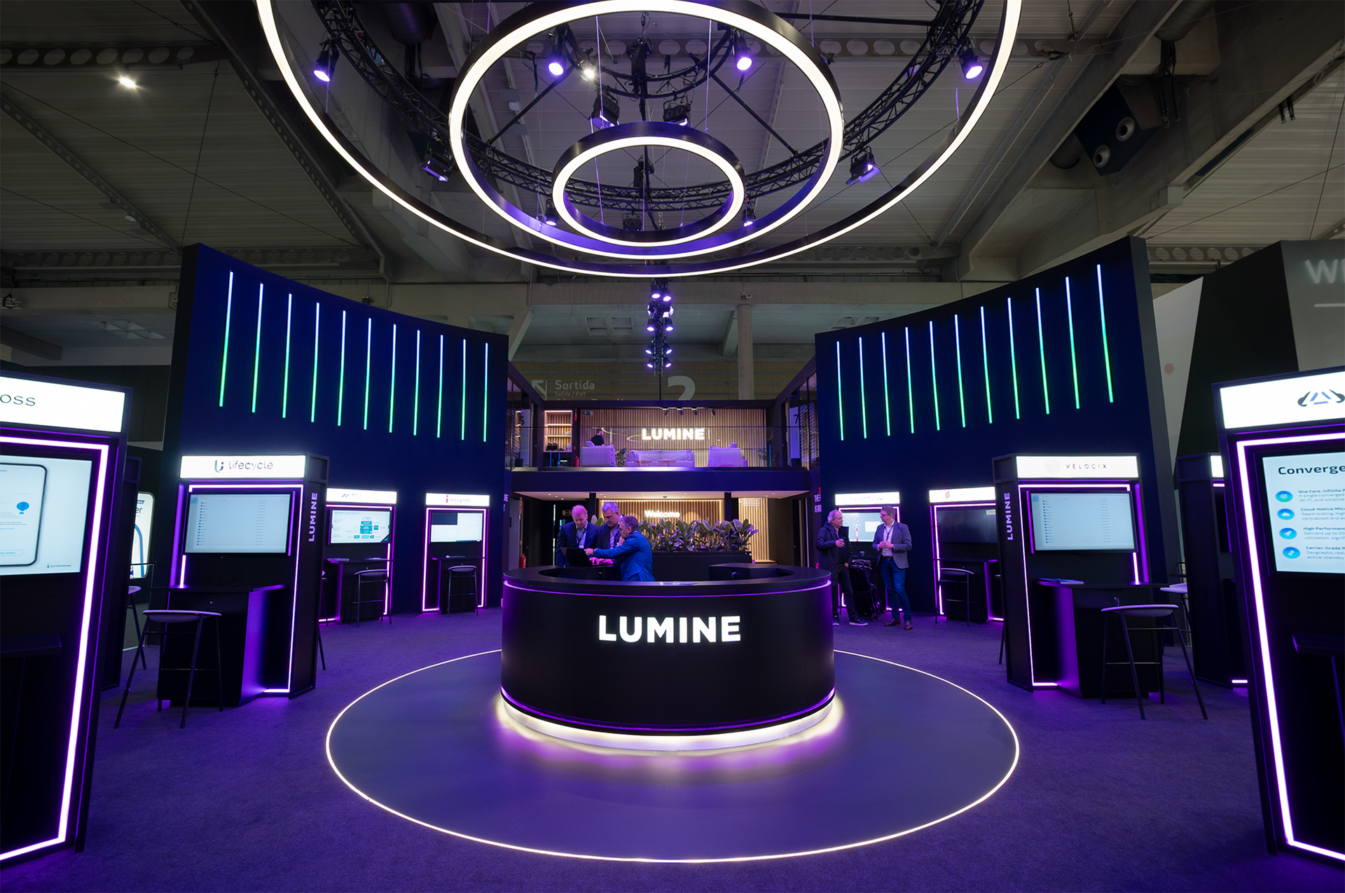
A recent project for Lumine Group at MWC Barcelona 2026 offers a useful illustration of how reception design can do multiple things simultaneously. At the heart of the stand was a circular 360-degree reception desk - a design choice that emerged directly from Lumine's own spherical brand motif. The circular form wasn't just decorative; it was functional. It gave the reception team full visibility across the entire stand, making it possible to see who was entering, where visitors were moving, and who was approaching the private areas at the rear of the space. Control and welcome, resolved in a single design element.
The desk also anchored a design language that ran through the whole space. The spherical light fitting overhead echoed its form - so the reception desk and the centrepiece lighting element were in deliberate conversation with each other, creating a visual coherence that visitors felt without necessarily being able to articulate why the space felt so considered. A practical element became a design element. Form and function, aligned. Around the desk, the stand used clear sightlines and thoughtful spatial planning to guide visitors through the public-facing front half - bold, dramatic, with double-height LED totems and a striking visual presence - and to control access to the invite-only hospitality zone at the rear, which offered an entirely different atmosphere: natural materials, softer light, the intimacy of a boutique hotel rather than a trade show.
The Lumine stand demonstrates something that applies equally to permanent corporate spaces: that the most effective design solutions are the ones where every element is doing more than one job. The desk isn't just a desk. The light fitting isn't just a light fitting. The transition from public to private isn't just a doorway. Each is a considered contribution to an experience that, taken together, tells a coherent brand story.
DESIGN CONSIDERATIONS BY SECTOR
It would be easy to assume that sector determines material palette - that technology companies default to glass and metal, financial services to timber and stone, creative agencies to something deliberately unexpected. In practice, it is rarely that simple. Any given sector contains multiple brands, each with distinct positioning, and the right material language for your stand or reception is a function of what your brand specifically stands for, not the industry you happen to be in.
What does hold true across sectors - and across scales of investment - is something more fundamental about human experience. When a visitor steps out of a public or shared space into a more private one, there should be a perceptible shift. It doesn't need to be stated; it should be felt. The atmosphere changes. The materials soften. The noise recedes.
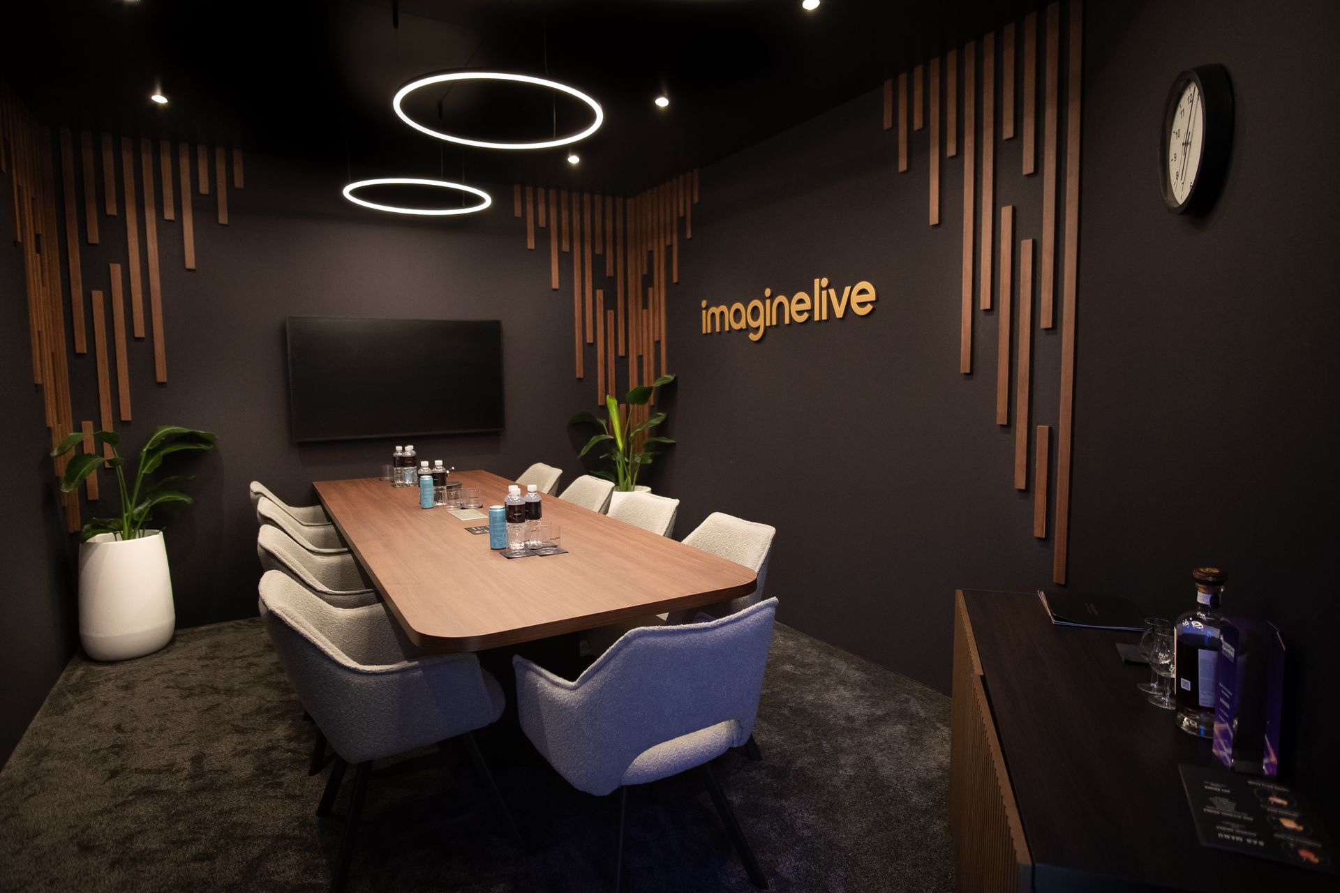
This transition scales across the full spectrum of exhibition hospitality. At one end, a true VIP boardroom: thick carpet underfoot, acoustic calm, rich materials that communicate investment and confidence. At the other, something much simpler - the shift from the open stand to a small meeting area, marked by a change in flooring, more comfortable seating, a warmer light temperature, some natural finish where the public zone had harder surfaces. The Lumine stand at MWC 2026 exemplified this well: the move from the stand's dramatic, high-energy public face to a more intimate hospitality zone at the rear was achieved through material softening and a quieter spatial atmosphere, not through walls or signage. Visitors felt the difference before they could have described it.
With that principle in mind, here is how brand positioning - rather than sector - tends to shape the specific choices:
- Technology and innovation brands span a wide range, from companies built on engineering precision to those whose product is fundamentally human and connected. A semiconductor business and a consumer platform business both operate in technology, but they require very different design languages. Precision, geometry and controlled lighting suit brands where technical authority is the primary message. Warmer, more approachable environments suit brands where the relationship between technology and human experience is the story.
- Communications and telecoms brands often benefit from design that expresses connectivity and flow - materials and spatial forms that suggest networks, movement, and the linking of people and places. The challenge is to avoid abstraction: the best executions in this sector make the idea of connection feel tangible and human rather than infrastructural.
- Financial and professional services firms tend to require environments that communicate stability and trust without tipping into identical navy blue and frosted glass. The distinction between authority and formality is a real one, and it is made in the details: the warmth of the timber species chosen, the softness of the textile, the quality of the lighting. A space that feels executive but not exclusive, serious but not severe, is the target.
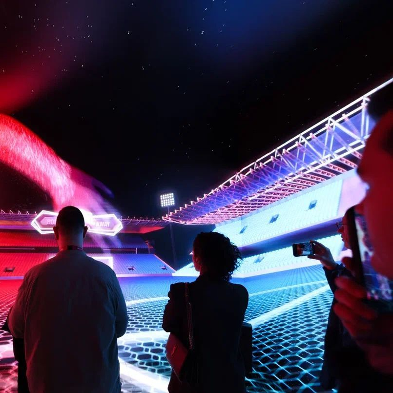
- Sports and entertainment brands can carry considerably more visual energy - and often should. The design challenge here is less about restraint and more about channelling the brand's dynamism into something that works spatially: that has genuine impact at distance, that creates atmosphere rather than simply displaying it, and that still functions as a professional environment when the meeting room door is closed.
- Creative and design-led organisations have the most latitude, and sometimes the most to lose from it. Expressiveness without discipline produces spaces that feel self-indulgent rather than confident. The brief is still to serve the brand and the visitor, not to showcase the designer.
Across all of these, the private space within the stand - however modest - should signal to whoever enters it that they have moved somewhere distinct. The materials, the forms, and the atmosphere that deliver that signal are where brand positioning does its work.
The most valuable corporate receptions are the ones where the underlying thinking - clarity of brand, quality of execution, design in service of experience - feel like they belong to the brand they were built for.
Explore Evolve's branded corporate spaces work →