What do organic and Geometric Forms Communicate?
Every exhibition stand makes an argument about the brand it represents. Some of that argument is carried in words; the messaging, the product names, the taglines. Some of it is carried in technology and interactivity. But a significant part of it is carried in something more fundamental: the physical shape of the space itself.
The choice between geometric and organic forms in exhibition stand design is one of the most expressive decisions a designer makes. It operates largely below the level of conscious awareness - visitors rarely articulate why one stand feels confident and precise where another feels fluid and welcoming but it shapes how a brand is perceived and remembered in ways that are real and measurable.
At Evolve, decisions about form are never arbitrary. Here is how we think about them.
What Geometric Forms Communicate
Geometric shapes with precise angles, defined edges and predictable symmetry communicate a specific set of brand values. Order. Confidence. Technical authority. The deliberate use of geometric forms in exhibition stand design signals that a brand knows exactly what it is and is not interested in being ambiguous about it.
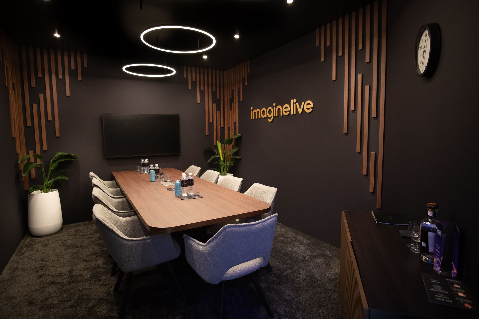
In B2B contexts such as technology, engineering, financial services and professional services, geometric design tends to perform well because it aligns with what these audiences value: precision, reliability, capability. A stand built around clean geometric architecture tells a technical audience that the company behind it thinks the same way they do.
- Hexagons are a good example of geometric design done well. Rather than the default rectangular grid, hexagonal elements, whether rigged LED arrays, structural modules, or display systems, can offer brands a more distinctive and ownable visual identity at a show. The repetition of a hexagonal motif creates immediate visual coherence across a stand and stands out in an environment where rectangular forms are the default.
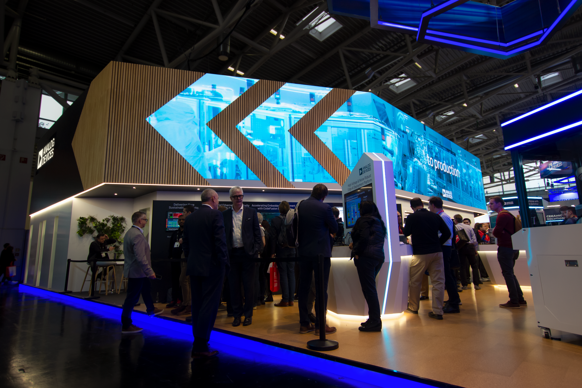
- Repeating motifs are where geometric design gains its real power. The principle is consistency: a geometric form used once is a detail; the same form used throughout a design becomes a language. In our 2024 work for Analog Devices, a triangular brand motif was carried through the entire stand design, from structural elements to graphic treatments, creating a coherent visual system that felt considered and authoritative rather than assembled. The stand didn't just represent the brand; it was an expression of the brand's precision and technical identity.
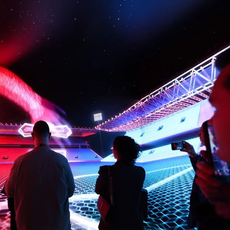
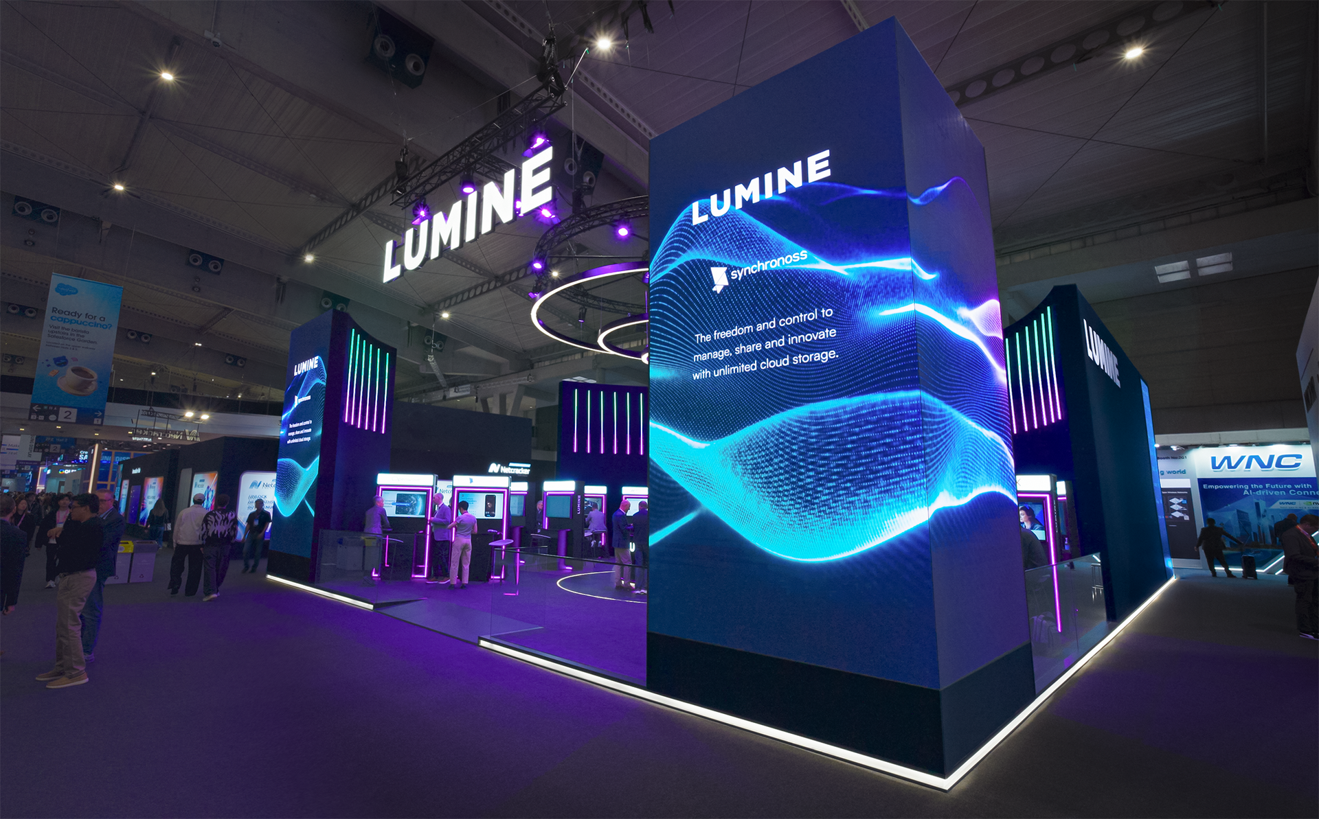
- Circular and wrap-around geometry solves a specific and common exhibition challenge: the corner or island plot that needs to face in multiple directions at once. A rectangular hanging banner can do this, but it does it bluntly. Circular LED screen architecture, with content flowing continuously around the stand, creates impact from multiple directions simultaneously, while communicating something about the brand that a rectangular solution doesn't: dynamism, modernity, a sense of movement and forward motion.
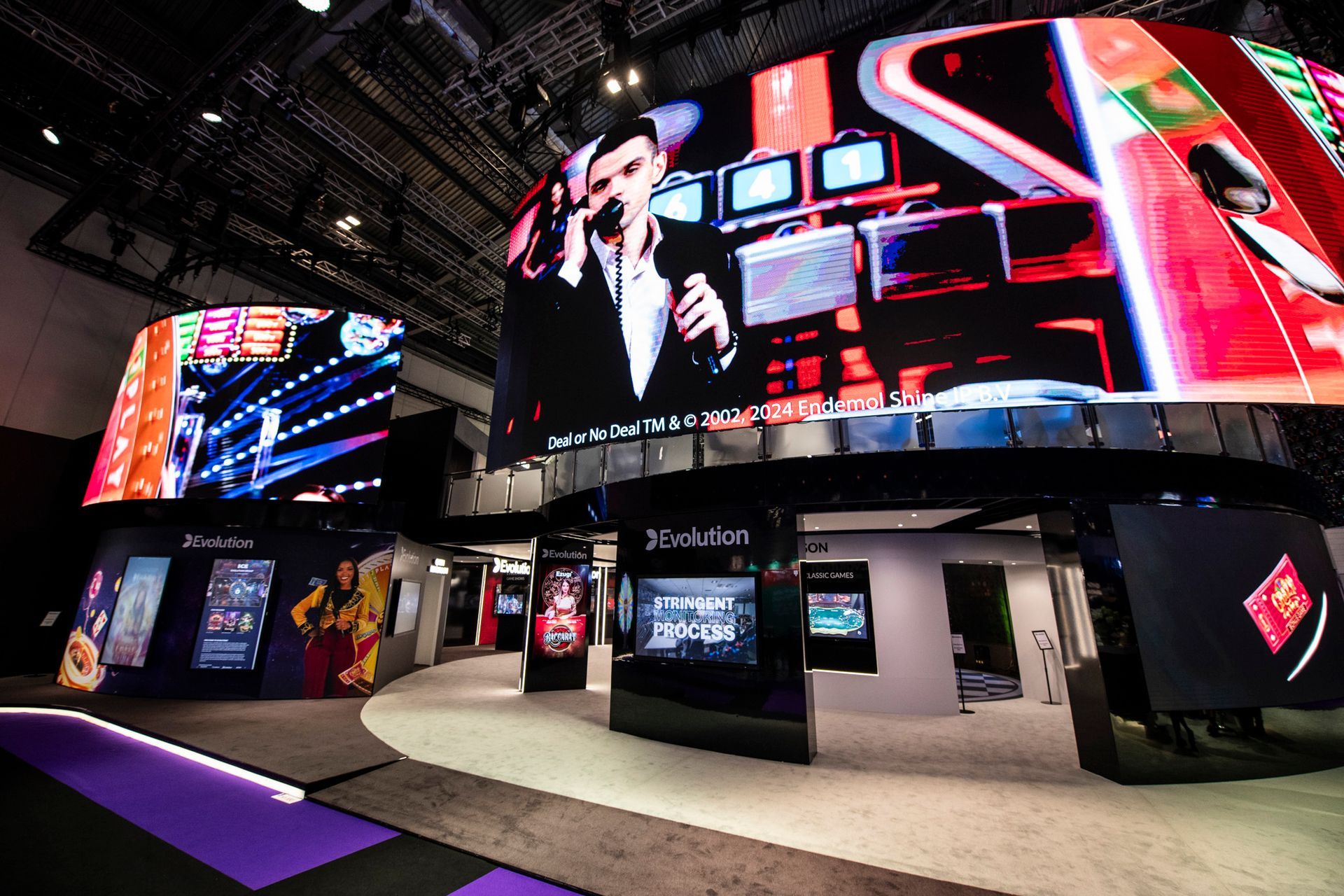
- One of our booth designs for Evolution at ICE made full use of exactly this logic. A wrap-around LED screen arrangement at the corner of their plot allowed content to flow around the stand continuously, generating visual energy in the aisle from multiple angles while delivering a brand impression significantly more progressive than a traditional static banner would have achieved.
What Organic Forms Communicate
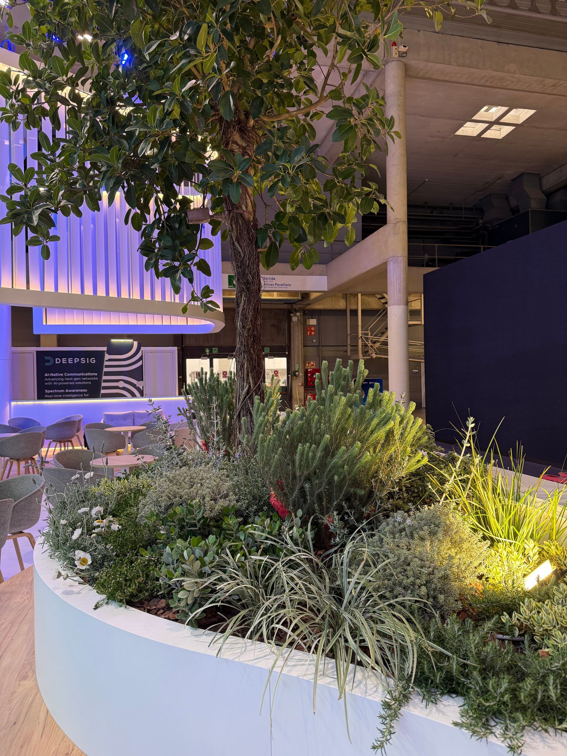
Organic shapes draw from a different emotional register. Irregular, fluid, and asymmetrical. Echoing the forms found in nature rather than the drawing board, they communicate warmth, naturalism, and approachability. Where geometric design signals precision, organic design signals humanity.
In exhibition stand design, organic forms are particularly effective for managing visitor flow. Curved spatial arrangements guide people through a stand intuitively, without the stop-start logic of rectangular corridors and right angles. The movement feels natural because it mirrors the way people actually move - along lines of least resistance, drawn towards openings rather than corners.
Some of our most recent stand designs take direct inspiration from the movement of water: the undulating quality of a calm surface, the way a current carries you forward without instruction. These spatial experiences work especially well for brands that want visitors to feel carried through a journey rather than navigating a floor plan.
Circular entrances and portal forms deserve particular mention. Nothing invites exploration quite like a circular opening. There is something instinctively appealing about a portal: the suggestion of a threshold, of passing from one space into another that is different and perhaps surprising. We used this logic for a video game title launch experience at Gamescom, designing a portal entrance that created a genuine moment of anticipation for visitors before they stepped through. The sense of crossing a boundary, of being admitted to something, is a powerful experiential device that organic, circular architecture enables in a way that a flat, rectangular entrance simply cannot.
Blending the Two: Where the Most Interesting Work Happens
The most compelling exhibition stand design rarely lives entirely within one vocabulary. The integration of geometric and organic forms - used with clear intent, not randomly combined - is where genuinely distinctive spatial work tends to happen.
A geometric structural frame creates clarity and presence. Organic elements within it such as curved furniture, flowing graphic treatments and softened transitions between zones add warmth and approachability without sacrificing the confidence of the overall architecture. The result feels both authoritative and human, which is precisely what most B2B brands are trying to communicate.
The key discipline is intentionality. Blending forms without a clear rationale produces spaces that feel uncertain rather than sophisticated. Blending them in service of a specific brand story - where the geometry expresses capability and the organic elements express the human relationship at the heart of the business can produce something cohesive and powerful.
This is the level at which Evolve's exhibition stand design team work. The question is never simply "geometric or organic?" It is: what story does this brand need to tell, and which forms carry that story most effectively? The answer often involves both, in proportions that are specific to the brand, the audience, and the show.
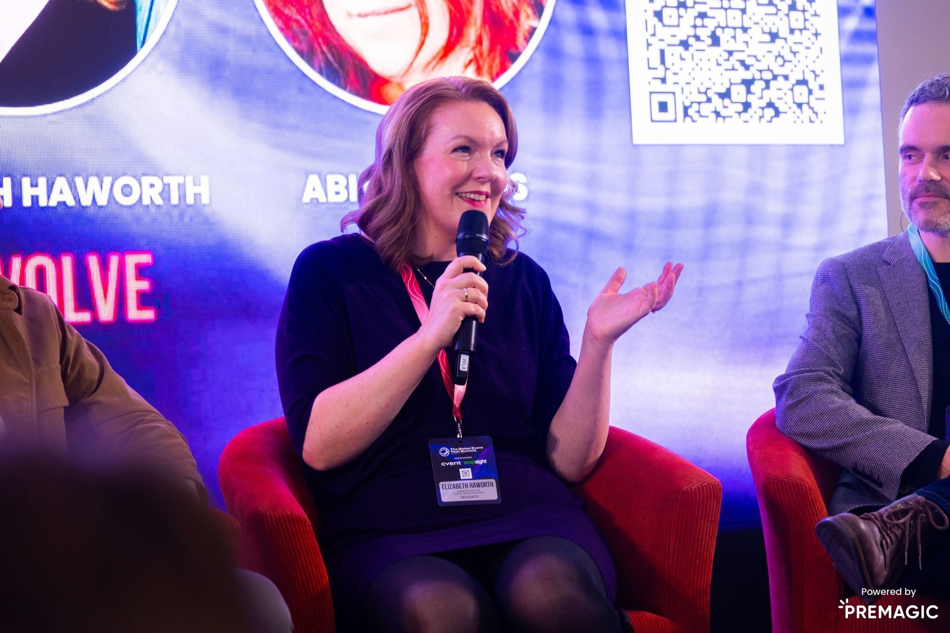
Evolve Creative Solutions designs and builds exhibition stands and brand experiences across Europe. If you'd like to explore how spatial form could work harder for your brand at your next show, we'd be glad to talk.